Segmented Control in SwiftUI
Aug 06, 2022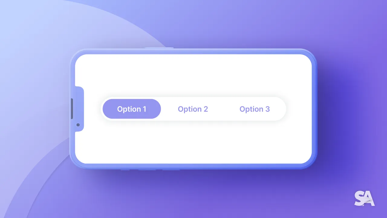
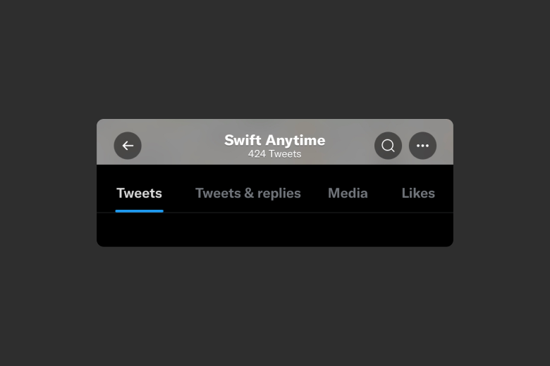
Segmented controls can be observed in social media apps - like in Twitter profile or Instagram profile view. If there were UIKit, we would use UISegmentedControl, but since it's SwiftUI, we used Picker with a specific picker style. So without further ado, let's dive straight into it. But before that, let's take a quick look at the human interface guidelines.
Human Interface Guideline Summary
Some takeaways from Human Interface Guideline:
- Limit the number of segments and try to be consistent with number of segments
- Be careful about content positioning in custom segmented control.
Human Interface Guideline Reference
Picker
We'll try to replicate the Twitter profile segmented control in native way. Let's define an enum first since enum is a great fit for this situation.
enum ProfileSection : String, CaseIterable {
    case tweets = "Tweets"
    case media = "Media"
    case likes = "Likes"
}
Note: We made ProfileSelection Case Iterable so that we can use this in a ForEach.
struct ContentView: View {
    @State var segmentationSelection : ProfileSection = .tweets
    var body: some View {
        Picker("", selection: $segmentationSelection) {
            ForEach(ProfileSection.allCases, id: \.self) { option in
                Text(option.rawValue)
            }
        }
        .pickerStyle(SegmentedPickerStyle())
        .padding()
    }
}
Result:
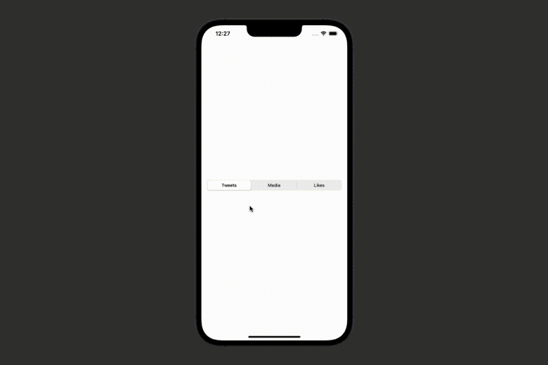
Here, we used a binding ProfileSection variable to order to have the initial selection value of the segmented control. Moreover, we looped through all the cases of profile section (using ProfileSection.allCases) and used the raw value of the enum case as title of each section. As an end result, every time we click on another section of segmented control, it changes the selection to the respective enum case.
They key here is to .pickerStyle(SegmentedPickerStyle()) otherwise you won't even be see to see what you expected.
Customising appearance
The SwiftUI segmented control provides a little to no customisation. And here the UIKit element comes to save the day!!
One way to do this is changing the properties of UIKit UISegmentedControl on the initialisation.
struct ContentView: View {

    init(){
        UISegmentedControl.appearance().selectedSegmentTintColor = .orange
    }

    @State var item = 0
    @State var segmentationSelection = options[0]

    var body: some View {
        Picker("", selection: $segmentationSelection) {
            ForEach(options, id: \.self) { option in
                Text(option)
            }
        }
        .pickerStyle(SegmentedPickerStyle())
        .padding()
    }
}
Result:
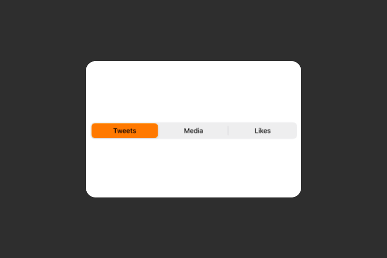
Note: If you have multiple segmented controls in single view, it will apply these values on all segmented controls.
Concluding the whole article, you learned how to build Segmented Control in SwiftUI using Picker and how to customise its appearance using the modifiers available for picker styling. We encourage you to read more related articles like Colors and Gradient in SwiftUI, SharePlay Implementation, Geometry Reader in SwiftUI, Slider in SwiftUI.
Signup now to get notified about our
FREE iOS Workshops!
