Colors and Gradient in SwiftUI
May 11, 2022
Colors are powerful. They can convey a message by the visuals and can give a certain kind of vibe to the art (for us, the app). It is one of those inevitable things that you are going to encounter while making pixel perfect production app.
Usage
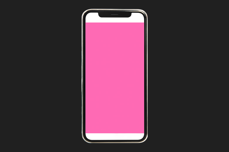
The primary usage that most developers encounter first in SwiftUI App Development is as for adding background and color to the view. Let's look into an example:
  VStack {
            Text("Lorem ipsum dolor sit amet, consectetur adipiscing elit. Fusce at ante sit amet turpis pretium porta. Cras id dui vel orci scelerisque efficitur et quis dui. Suspendisse tortor nisi, euismod scelerisque sollicitudin in, euismod non ligula. Nulla id risus lobortis nunc venenatis tincidunt. Vestibulum elementum ex est, non sagittis odio dictum eget. Suspendisse non dolor pulvinar, vulputate ligula sit amet, aliquam lorem. Fusce leo ipsum, tempus quis ipsum a, accumsan sagittis justo. Duis placerat, purus vitae ornare semper, enim eros egestas metus, eu euismod arcu ante sed dui. Proin blandit auctor fermentum. Nulla elementum nibh sit amet metus suscipit, eget cursus sapien eleifend. Curabitur tempus mi malesuada quam tempus posuere. Pellentesque ullamcorper tempus dapibus.")
        }
        .padding()
        .foregroundColor(.white)
        .background(Color.blue)
Result:

In the above code, you have Text with a lorem ipsum paragraph in a VStack. Then, padding() modifier is added to add some spacing. Then, foregroundColor modifier is used to give white foreground text to it. Moreover, background modifier is also added to the view to give the particular color as background.
Note here, you can also use color as a view.
struct ContentView: View {
    var body: some View {
            Color.red
    }
}
You can observe how the Color.red in the code snippet acts as a standalone view and takes all the available space.
Result:

Primary And Secondary Colors
You can access a few set of colors in SwiftUI but there is a couple of colors that we are going discuss today : Primary and secondary colors. Before understanding it, let's look at a code example:
VStack(alignment: .leading, spacing: 20) {

            Text("Swift Anytime")
                .bold()
                .font(.title)
                .foregroundColor(.primary)

            Text("Think of Swift. Think of Us.")
                .foregroundColor(.secondary)

        }
You have a VStack with a couple of text, one with primary color as foreground color and second one as secondary color as foreground color. When the color scheme is switched, these colors change too. It can be used for coloring the text content so that it's color responds to the system mode change in a well manner.
Result:

Note: Color Scheme refers system wide color appearance in apple ecosystem i.e. light mode and dark mode.
Initializing Colors
SwiftUI provides with multiple ways to initialize colors. One way to do it is using Color(red: ..., green: ..., blue: ...). You can provide the RGB (Red, Green, blue) value on a 0-1 range.
Color(red: 255/255, green: 105/255, blue: 180/255) // Hot Pink Color
You can also initialize color with UIColor (from UIKit) and NSColor (from AppKit). Let's try to initialize hot pink with UIColor this time.
Color(uiColor: UIColor(red: 255/255, green: 105/255, blue: 180/255, alpha: 1))
The result of both the initialization given above would be the following:
Using Color from Assets folder
You can also add color via Assets folder. For adding a color set, you go to the Assets Folder -> Click "+" button on bottom left corner -> "Add Color Set".

You can customize the color for a particular color scheme or can have the same color for both modes.
The asset colors can be used in app by Color("colorName"). In our example, this color can be used in code by:
Color("SomeColor")
Opacity
You can play around with the opacity of the color by using opacity(...) modifier where you can enter the opacity between the range of 0 to 1.
       ZStack {
                Color.gray
                    .opacity(0.5) // Setting the color opacity to 0.5
                Text("Swift Anytime")
                    .foregroundColor(.black)
                    .font(.largeTitle)
                    .bold()
            }
Result:

Gradients
SwiftUI provides three type of gradients. Gradients can be used for adding vibrant and bright backgrounds. Let's explore those.
Linear Gradient
The simplest gradient is linear gradient. You can provide the start and end point along with an array of colors.
  LinearGradient(colors: [.orange, .red],
                       startPoint: .top,
                       endPoint: .center)
Result:
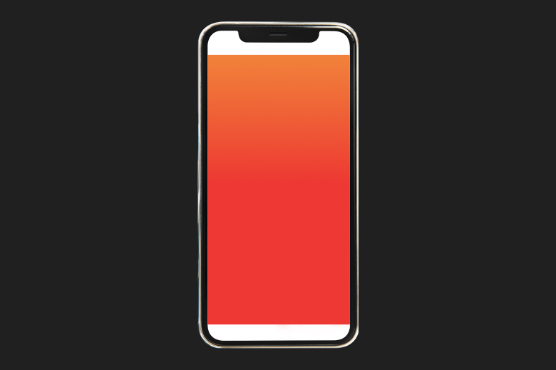
In the above example, the gradient starts and end at the top and center respectively. Moreover, you can observe that using a correct combination of colors can create a great blend of colors with a very organic gradient.
Angular Gradients
Angular Gradients (also called "conic" gradients) are the gradients where the color change is based on the angle.
  AngularGradient(colors: [.red, .green, .blue, .purple, .pink],
                           center: .center,
                           startAngle: .degrees(90),
                           endAngle: .degrees(360))
Result:
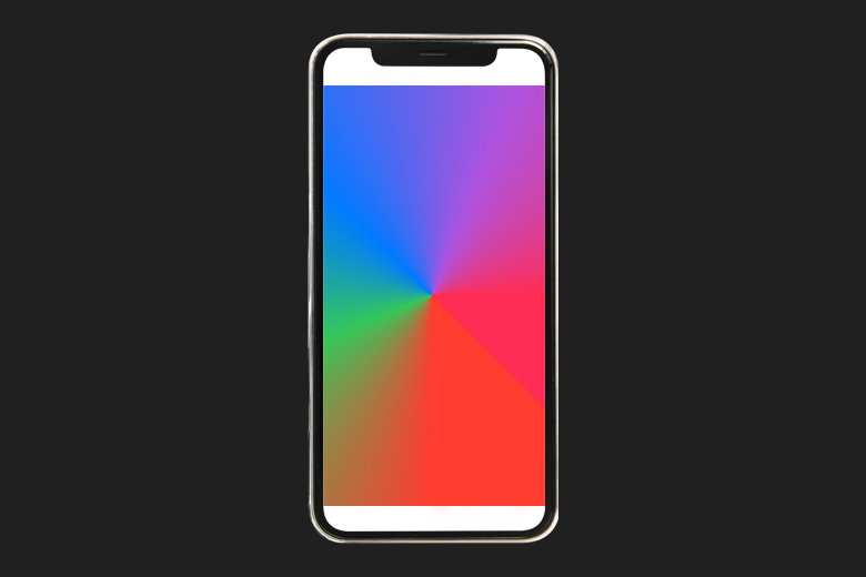
here, the angular gradient is initialized with an array of colors, the center of the gradient and the start and end angle. Note here that the start and end angle is added in form of degrees here. But, you can also add it in form of radians by .radians(...).
Radial Gradients
Radial Gradient basically starts adding up the color concentrically from the center point and scales to fit it in the given radius ie. the start and end radius
 RadialGradient(colors: [.red, .yellow, .blue, .green],
                       center: .center,
                       startRadius: 20,
                       endRadius: 150)
Result:
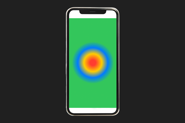
You can observe how the colors start to eccentrically get around each other, starting from red and ending it at green, thus, forming a radial gradient.
Congratulations! You deserve to celebrate this moment. Today you learned about colors and its different initilization, setting its opacity and its usage along with different type of gradients.
Signup now to get notified about our
FREE iOS Workshops!
