Toggle in SwiftUI
Nov 26, 2022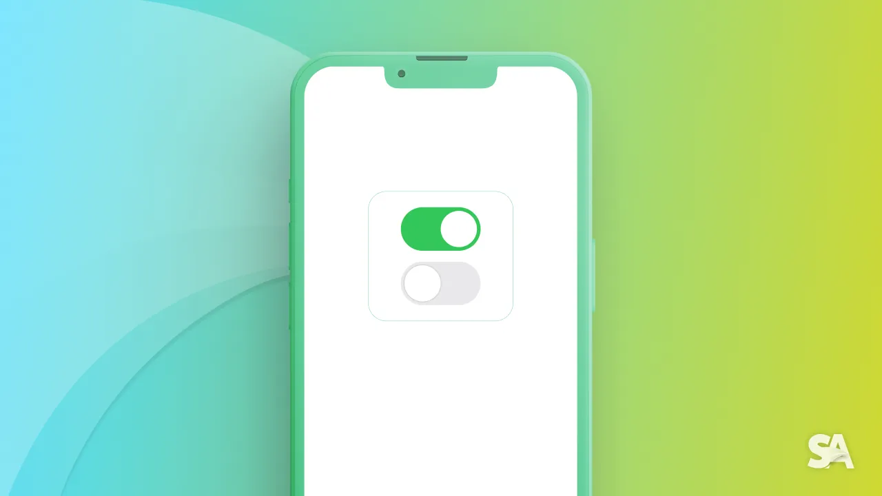
Toggles are some of the most used UIControl in iOS Apps since it lets let you switch between a binary state - true or false, 0 or 1.
You are most likely to encounter a toggle in settings or some kind of list view. But regardless of your app has settings or not, it doesn't hurt to learn about Toggle in SwiftUI. Before diving into a toggle, let's take a look at Human Interface Guideline.
Note: This is UIKit equivalent of UISwitch

Takeaways from Human Interface Guideline
- Recommended to use it in table row only.
- Recommended not to add a lot of labels for description.
Basic Implementation
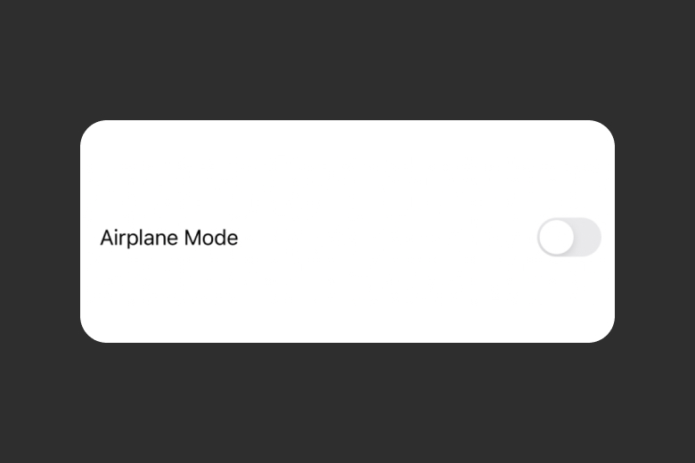
For you to implement a basic toggle, you require a binding boolean and a string that would label the string. Let's give it a try.
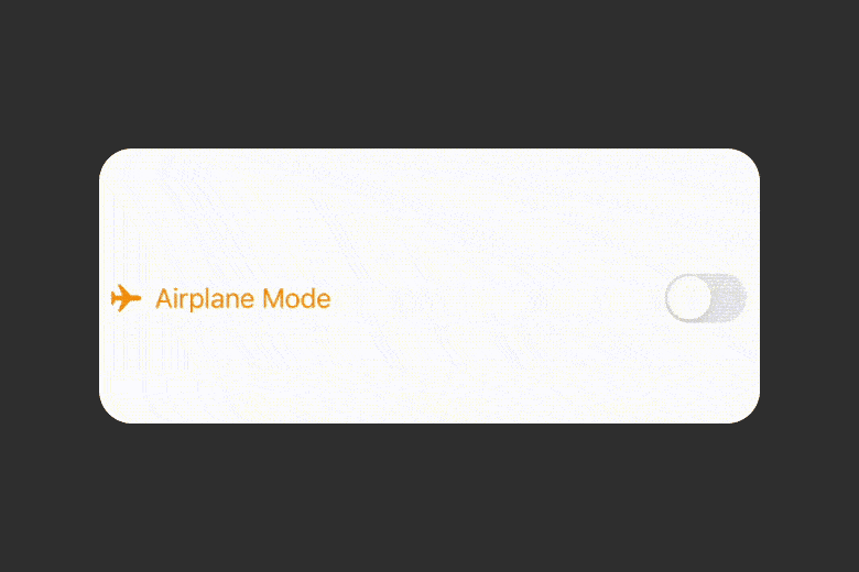
 @State var isOn = false // 1
    var body: some View {
        Toggle("Airplane Mode", isOn: $isOn) // 2
            .padding()
    }
Result:
Code Explanation:
- Defining a bool variable
isOnwhich is later used in the toggle init as a Binding. - Displaying a toggle with initialize of label and
isOn.
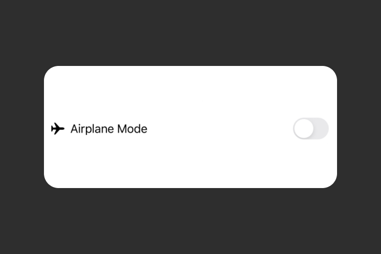
In the case you are looking for a custom modifier, you can go for the init with label.
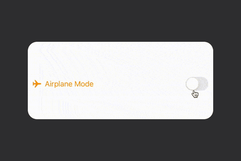
@State var isOn = false
    var body: some View {
        Toggle(isOn: $isOn, label: { // 1
            Label("Airplane Mode", systemImage: "airplane") // 2
        })
            .padding()

    }
Result:
Code Explanation:
- Defining toggle with
labelinit. - Using a Label with some relevant text and airplane SF symbol.
Styling appearance
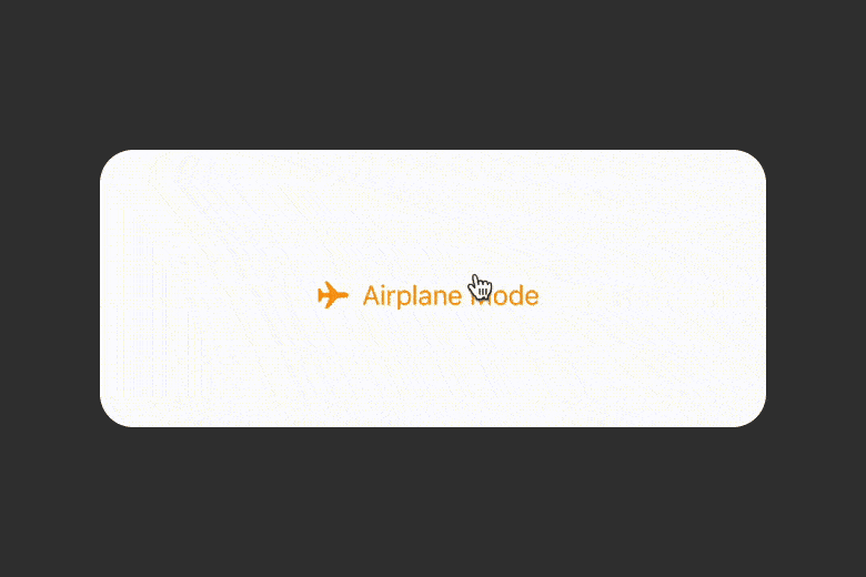
You can apply all the style modifiers that are applicable to a SwiftUI view. But there are a couple of styles which are specific to button toggle.
Eventhough, there are a couple of style which are highlight worthy. One is to use a toggle style of button (by ButtonToggleStyle) and have a button that changes the background color based on the toggle state.
           Toggle(isOn: $isOn, label: {
            Label("Airplane Mode", systemImage: "airplane")
        })
            .toggleStyle(ButtonToggleStyle())
            .foregroundColor(.orange)
            .padding()
Result:
Another way, which is default and the one that you are most likely to encounter is the toggle switch way where there is a switch and you can turn it off and on.
		    Toggle(isOn: $isOn, label: {
            Label("Airplane Mode", systemImage: "airplane")
        })
            .toggleStyle(SwitchToggleStyle())
            .foregroundColor(.orange)
            .padding()
Result:
If you have a switch and you want to change the tint color, you can do it by using tint(...) for iOS 15 and later.
struct ToggleUI: View {
    @State var isOn = false
    var body: some View {
        Toggle(isOn: $isOn, label: {
            Label("Airplane Mode", systemImage: "airplane")
        })
            .toggleStyle(SwitchToggleStyle())
            .tint(.gray)
            .foregroundColor(.orange)
            .padding()
    }
}
Result:
For iOS 15 or earlier, you can use the following style modifier:
.toggleStyle(SwitchToggleStyle(tint: .gray))
Concluding the article, today you learned about how to integrate a toggle switch in your app and you can customize it in form of a button and change the tint color.
Signup now to get notified about our
FREE iOS Workshops!
