SwiftUI 4 TextField, ShareLink & Presentation Detents
Jun 28, 2022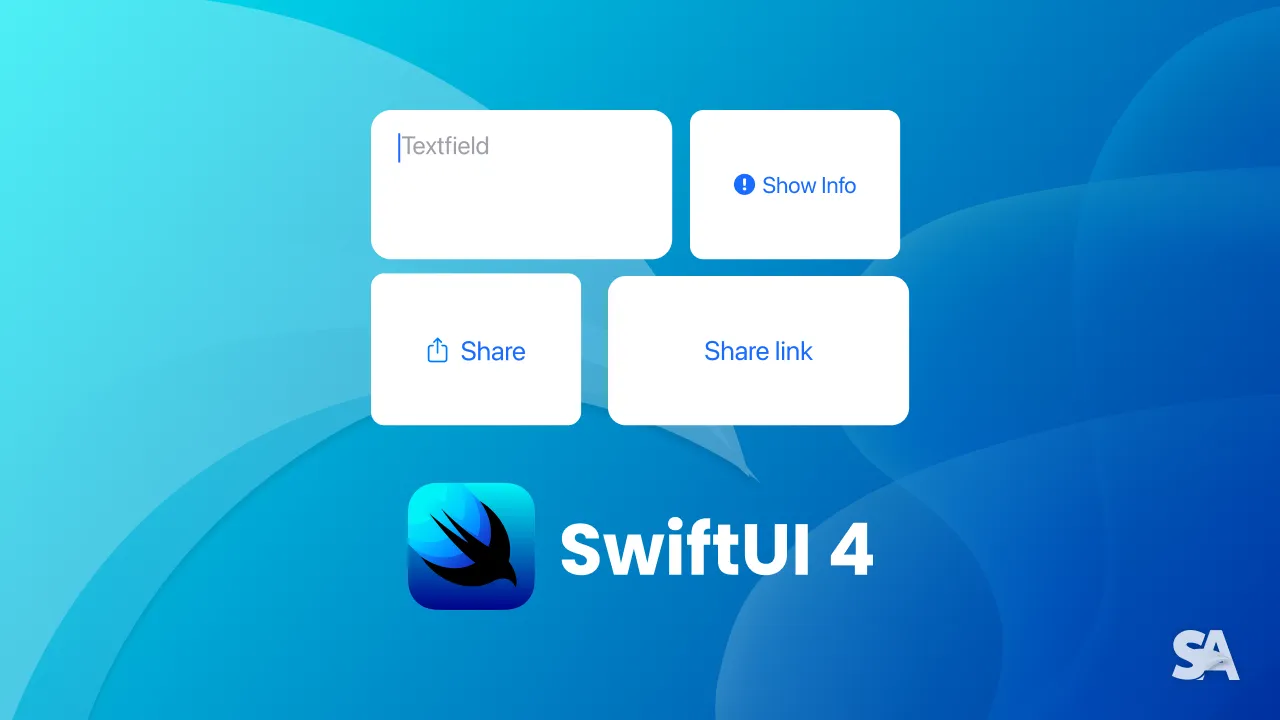
Now that you have explored about new color gradients, SF symbol rendering modes, variable colors and more in the Part 1, let's talk about native half sheet presentation, share sheet links and new modifiers in TextField. So without further ado, let's dive in.
Presentation Detents
Before SwiftUI 4, for implementing half sheet presentation, one would usually have to go some hack and implement UIViewRepresentable since there was no native way to do it in SwiftUI. But this year they introduced presentationDetents modifier which lets you select possible size - may it be giving a specific height or selecting small, medium or large size. Let's give it a try.
struct ContentView: View {
    @State var presentHalfSheet = false // 1
    var body: some View {

            Button {
                self.presentHalfSheet = true // 2
            } label : {
                Label("Show Info", systemImage: "info.circle.fill") // 3
            }.sheet(isPresented: $presentHalfSheet) {
            AnotherView()
                .presentationDetents([.medium]) // 4
                .presentationDragIndicator(.visible) // 5
        }
    }
}
Code Explanation:
- Declaring a state variable
presentHalfScreenwhich we are going to toggle for showing the presentation. - Toggling the present half screen on the button click.
- Using a label with info circle SF Symbol for the button.
- Giving the medium property to the presentation detents.
- Making the draggable grey line visible at the top of the view.
This time let's try giving more sizes in the presentation detents.
  AnotherView()
         .presentationDetents([.medium, .large])
         .presentationDragIndicator(.visible)
You can see how the same view presents the medium view and on dragging the gray line, it can expand to the larger view.
You can also hard-code the presentation view to a certain height.
  AnotherView()
                .presentationDetents([.height(200)])
                .presentationDragIndicator(.visible)
You can observe that on the drag, the view didn't expand more than hard-coded height (200px in this case).
Apart from that, you can also give a custom height or give a fraction of the screen as the presentation.
Sharing - ShareLinks
In previous versions, there was no native way to show share sheets. Thus, one had to use a UIActivityController via UIViewRepresentable. SwiftUI 4 introduces a native way of showing a share sheet. Let's give it a try.
ShareLink(item: URL(string:“https://www.swiftanytime.com”)!) // 1 Code Explanation:
- Here, the ShareLink is initialized with an URL item. You can use any
Datatype for that init.
You can see how giving no label to the ShareLink defaulted in a share button and label icon. Let's try using a share link with a label now.
ShareLink(item: URL(string:"https://www.swiftanytime.com")!) {
    Text("Share link")
}
ShareLinks have a tendency to adapt to according to the context, i.e. if its used in context menus or a toolbar, the share link will adapt to it. Let's see it in action.
Text("Share link in navigation bar")
    .toolbar { // 1
        ToolbarItem(placement: .navigation) { // 2
            ShareLink(item: URL(string:"https://www.swiftanytime.com")!)
        }
    }
Code Explanation:
- A toolbar was added to some text.
- A toolbar item was added with the placement of a navigation bar.
TextField
The line limit and the automatic height control was quite restricted in previously in SwiftUI since there was not a lot of control over the line limit. With SwiftUI 4, you can use a range as the line limit so the text field would expand based on the text given.
TextField("Textfield", text: $textfield, axis: .vertical) // 1
    .lineLimit(3...10) // 2
Code Explanation:
- TextField with
axisinitializer was used. The axis modifier decides in on which axis the text field will expand when more text is added. - Assigning the line limit as the range 3-10.
You can see how the initial line limit is 3 and later when more text was added, the text field expanded accordingly.
Congratulations! You deserve to celebrate this moment. Today you learned about presentation detents, its size options, share links, it's different initializers and the new text field line limits and axis. We encourage you to read more related articles like Geometry Reader and Colors and Gradient.
Signup now to get notified about our
FREE iOS Workshops!
