Slider in SwiftUI
Jul 28, 2022
Sliders are a replacement of UISlider from UIKit. You could observe the use of slider mostly in forms where one has to value from a big range. In the case you are looking forward to use this, let's dive into Slider in SwiftUI.
Table of Contents
1. Slider Terminologies
2. How to implement a SwiftUI Slider
3. Adding Steps to SwiftUI Slider
4. SwiftUI Slider with minimum and maximum value labels
5. Styling a SwiftUI Slider
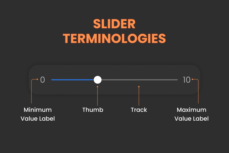
Slider Terminologies
Let's take a look at a picture that describes all the elements of a slider and what they are called.
How to implement a SwiftUI Slider
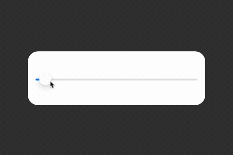
Implementing a normal Slider is as easy as initiating a normal SwiftUI view. All you need is a state value to store the current value of the slider and a range inside this range the slider's value will be changed according to the thumb's relative position to start point.
//1
@State var sliderValue : Float = 0.0
var body: some View {
    //2
    Slider(value: $sliderValue, in: 0...10)
    // 3
    .padding()
}
Result:
Code Explanation:
- Here, the definition of sliderValue is done as a Float value. You could use any other type of numeric value that conforms to BinaryFloatingPoint.
- Here, you can see that a binding of type float (sliderValue) is passed for value parameter and in the second parameter, the range is defined from 0 to 10 by writing
0...10. - Finally, some padding was added so it have some white space from the screen edges.
Adding Steps to SwiftUI Slider
As seen above, sliders are seamlessly scrollable which will change the sliderValue gradually in decimal precision. But, what if you want it to have certain divisions and want to slider it separated part in steps like incrementing by 2 units. In that case, you could implement steps. In the following code, the slider has a step of 2. So, every 2 divisions, you could increment/decrement the value.
Moreover, you can observe the use of trialling closure parameter onEditingChanged. It is used to print the current value of slider thumb every time the slider selection is changed.
@State var sliderValue : Float = 0.0
var body: some View {
    Slider(value: $sliderValue,
           in: 0...10,
           step: 2) { didChange in
        print("Did change: \(didChange)")
    }.padding()
}
Result:
SwiftUI Slider with minimum and maximum value labels
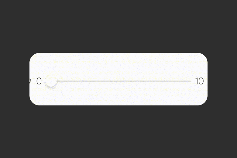
For practical applications, you would want your slider to have an icon or text representing the minimum and maximum value of the slider. In Slider, one could add some text by default. So, let's see how you can add some text as minimum and maximum value showing 0 and 10 with title 2 font size and thin font weight.
Note: If you are looking for something more than Text as values, go for an HStack
@State var sliderValue : Float = 0.0
var body: some View {
    Slider(value: $sliderValue, in: 0...10) {
        Text("Slider")
    } minimumValueLabel: {
        Text("0").font(.title2).fontWeight(.thin)
    } maximumValueLabel: {
        Text("10").font(.title2).fontWeight(.thin)
    }.padding()
}
Result:
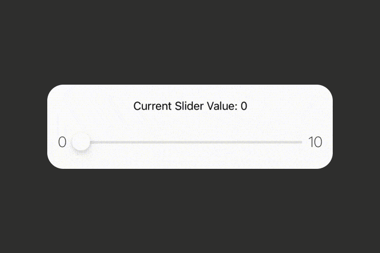
Styling a SwiftUI Slider
Let's create and view where one can visualise the current value of slider as one changes/slides it. For that implementation, let's use VStack containing text and the slider. Here, you can see the use of string interpolation to show the current value in text by referring to the defined state variable that is typecasted to int for sake of simplicity, but if you want you can keep it as float which will result the text show the decimal values.
You can add more customisation to the slider by tinting the slider track using .tint(...) modifier on iOS 15 and above, for iOS version less than this, you can use .accentColor modifier.
@State var sliderValue : Float = 0.0
var body: some View {
    VStack {
        Text("Current Slider Value: \(Int(sliderValue))")
        Slider(value: $sliderValue, in: 0...10) {
            Text("Slider")
        } minimumValueLabel: {
            Text("0").font(.title2).fontWeight(.thin)
        } maximumValueLabel: {
            Text("10").font(.title2).fontWeight(.thin)
        }
        .tint(.red)
        .padding()
    }
}
Result:
Where to go next?
Concluding the whole article, you learned how to play with Slider and about different terminologies for slider, adding maximum and minimum value label, steps and customising the appearance. We encourage you to read more related articles like Colors and Gradient in SwiftUI, SharePlay Implementation, Geometry Reader in SwiftUI.
Signup now to get notified about our
FREE iOS Workshops!
