Custom Shapes in SwiftUI
Nov 13, 2023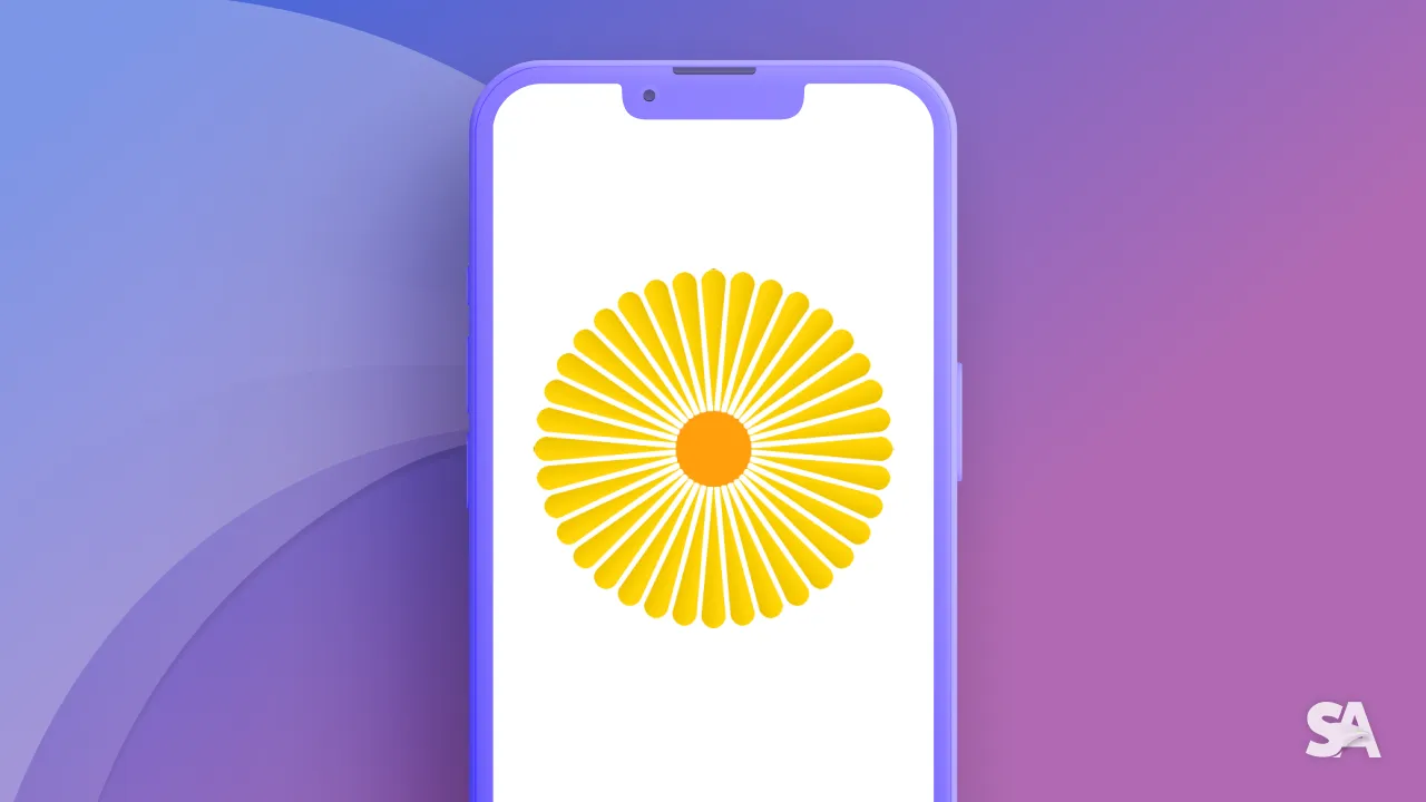
Have you ever used Rectangle(), RoundedRectangle(cornerRadius: _), Circle() or Capsule() for layout in SwiftUI? The answer is likely Yes.
It is because they are so convenient to use. But have you ever wonder what they are actually? Are they just normal View? The answer is NO, they are Shape.
Shape Protocol
In SwiftUI, Shape refers to a protocol that defines the outline of a view or control. It's a fundamental concept for drawing and designing custom views or controls with different shapes. The Shape protocol is part of the SwiftUI framework, which is used to create user interfaces in a declarative manner.
The Shape protocol has one required method:
func path(in rect: CGRect) -> PathThis method is used to create a path that defines the outline of the shape within the given rectangle. The Path type is used to describe a series of lines and curves that form the shape's boundary.
As you can see this function has only 1 parameter which is a CGRect. This is the space that will be available for us to draw. This CGRect specifies the area where the shape is to be rendered.
This is a 2 dimensional space so to identify the position of one point we need a x-value and a y-value. Sounds familiar, isn't it? But there is a catch here.
In context if Swift, the origin point(0, 0) will be at the top left corner. This will be different from what we learned in Mathematics about the Descartes coordinate system, but that is the way. Take a look at the picture:
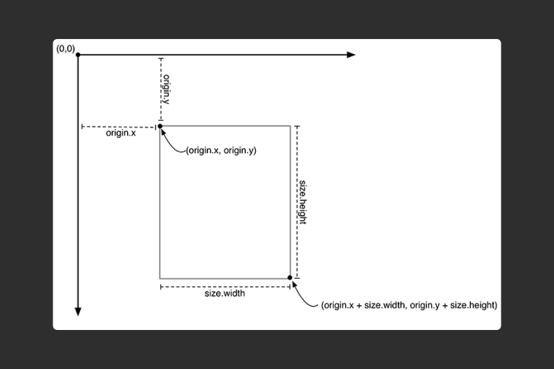
As we move the right, the x-value will increase and as we move down the y-value will increase. Let's take this knowledge to practice starting with some basic geometry shape.
Drawing Custom Shapes
Triangle
You can conform to the Shape protocol to create custom shapes, and you can use these custom shapes in SwiftUI views to draw, fill, or stroke them as needed.
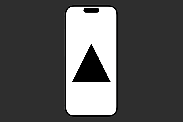
Let's first create a custom Triangle. Let's make a struct Triangle that conform to Shape protocol:
struct Triangle: Shape {
    func path(in rect: CGRect) -> Path {
        var trianglePath = Path()
        return trianglePath
    }
}
This function need to return a Path, so we declare, initialize and return it. For now nothing will happen, it is because we haven't drawn anything.
The first method we want to introduce with Path is move(to end: CGPoint), this will mark the position where our path start. We will start draw at the middle point on the top:
var trianglePath = Path()
trianglePath.move(to: CGPoint(x: rect.midX, y: rect.minY))
return trianglePath
Next, we will use addLine(to end: CGPoint), this method appends a straight line segment from the current point to the specified point. Now from our starting point, we will add line to the bottom trailing point, then draw to bottom leading point and from there back to our original middle top point:
var trianglePath = Path()
trianglePath.move(to: CGPoint(x: rect.midX, y: rect.minY))
trianglePath.addLine(to: CGPoint(x: rect.maxX, y: rect.maxY))
trianglePath.addLine(to: CGPoint(x: rect.minX, y: rect.maxY))
trianglePath.addLine(to: CGPoint(x: rect.midX, y: rect.minY))
return trianglePath
We can now use our Triangle:
struct ContentView: View {
    var body: some View {
        HStack {
            Triangle()
                .frame(width: 300, height: 300)
        }
    }
}
Result:
With this triangle, let's do some fun things by apply some modifiers to it:
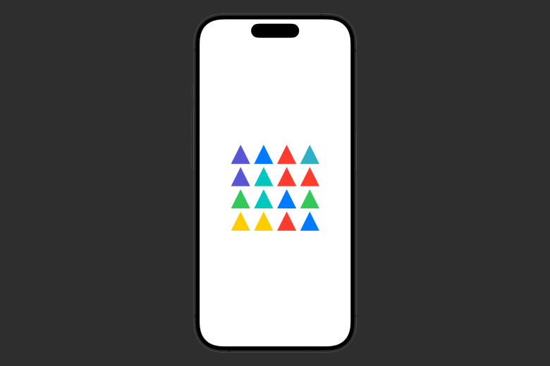
struct ContentView: View {
let colors: [Color] = [.red, .orange, .yellow, .green, .blue, .teal, .indigo, .mint]
var body: some View {
VStack {
ForEach(0...3, id: \.self) { _ in
HStack(spacing: 10) {
ForEach(0...3, id: \.self) { _ in
Triangle()
.fill(colors.randomElement() ?? .primary)
.frame(width: 50, height: 50)
}
}
}
}
}
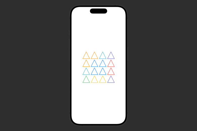
} Using the fill view modifier, we change change color of a Shape. Here, we create a four by four triangle board and fill them randomly from our set of colors:
Or stroking them using stroke view modifier:
struct ContentView: View {
    let colors: [Color] = [.red, .orange, .yellow, .green, .blue, .teal, .indigo, .mint]

    var body: some View {
        VStack {
            ForEach(0...3, id: \.self) { _ in
                HStack(spacing: 10) {
                    ForEach(0...3, id: \.self) { _ in
                        Triangle()
                            .stroke(colors.randomElement() ?? .primary, lineWidth: 2.0)
                            .frame(width: 50, height: 50)
                    }
                }
            }
        }
    }
}
Result:
Be creative:
struct ContentView: View {
    let colors: [Color] = [.red, .orange, .yellow, .green, .blue, .teal, .indigo, .mint]

    var body: some View {
        ZStack {
            ForEach(0...30, id: \.self) { index in
                Triangle()
                    .stroke(colors.randomElement() ?? .primary, lineWidth: 2.0)
                    .frame(width: 350 - CGFloat((index * 10)), height: 350 - CGFloat((index * 10)))
            }
        }
    }
}
Result:
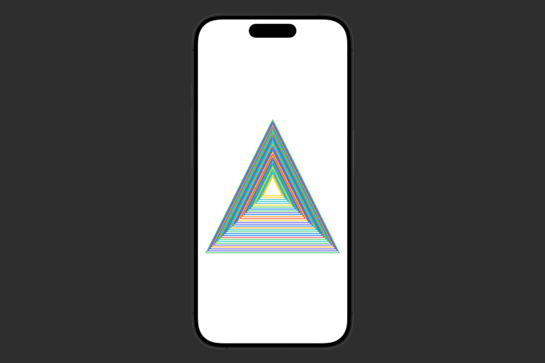
Magnificent, isn't it! With just some simple lines of code we have created. To me this really show the power of SwiftUI and declarative programming.
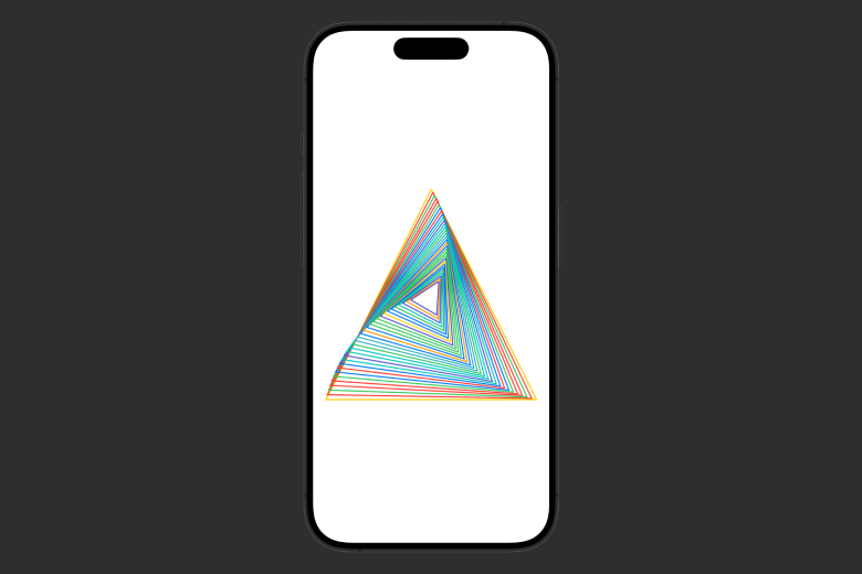
Let's be more artistic here by adding another modifier: rotationEffect(_ angle: Angle, anchor: UnitPoint = .center). This modifier will rotate the view’s rendered output around the specified point in 2 dimensional space.
struct ContentView: View {
    let colors: [Color] = [.red, .orange, .yellow, .green, .blue, .teal, .indigo, .mint]

    var body: some View {
        ZStack {
            ForEach(0...30, id: \.self) { index in
                Triangle()
                    .stroke(colors.randomElement() ?? .primary, lineWidth: 2.0)
                    .frame(width: 350 - CGFloat((index * 10)), height: 350 - CGFloat((index * 10)))
                    .rotationEffect(.degrees(Double(index)))
            }
        }
    }
}
Result:
With SwiftUI, we can just keep adding view modifier after each other. Let's twist this with offset(x: CGFloat = 0, y: CGFloat = 0)
struct ContentView: View {
    let colors: [Color] = [.red, .orange, .yellow, .green, .blue, .teal, .indigo, .mint]

    var body: some View {
        ZStack {
            ForEach(0...30, id: \.self) { index in
                Triangle()
                    .stroke(colors.randomElement() ?? .primary, lineWidth: 2.0)
                    .frame(width: 350 - CGFloat((index * 10)), height: 350 - CGFloat((index * 10)))
                    .rotationEffect(.degrees(Double(index)))
                    .offset(x: CGFloat(index * -3), y: CGFloat(index * -10))
            }
        }
    }
}
Result:
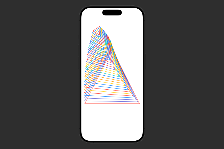
We are Picasso now. To this point, we hope you recognize the power of SwiftUI and Shape. We can easily reuse our shape: use it as a View, a background or for decorations.
Now let's review what we just learn by drawing a more complicated Shape: a Flower.
Flower
Recently, we took a chance with the inspiration from the Flowers Festival in Vietnam to draw some different types of Flowers.
Let's draw this beautiful yellow daisy flower:
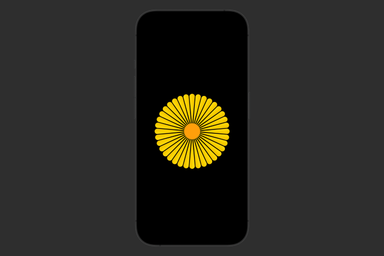
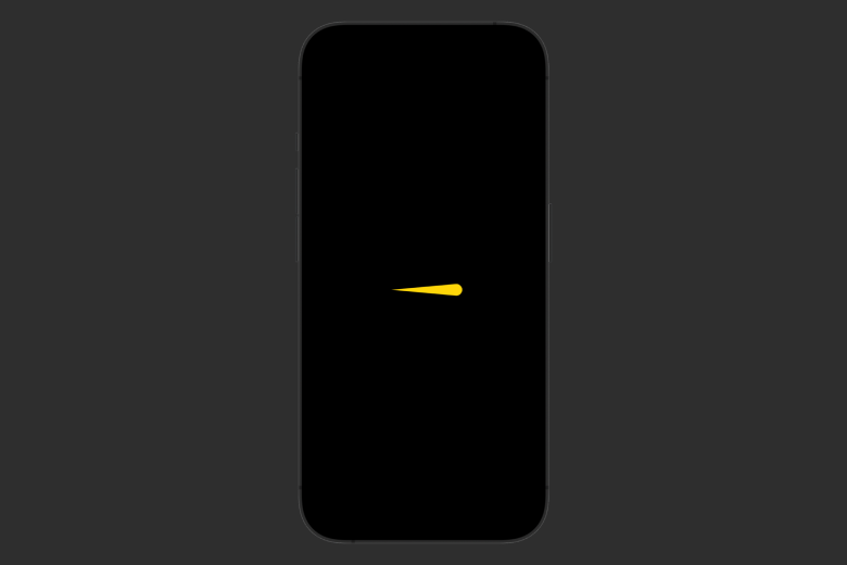
Now to draw this Flower Custom Shape, we separated them into 2 component: the Pistil and the Petal. The Pistil is simple here with Circle Shape. But its Petal is where we need to make a Custom Shape. And it is easy in SwiftUI.
Let's make our custom DaisyPental:
struct DaisyPental: Shape {
    func path(in rect: CGRect) -> Path {
        var path = Path()
        path.move(to: CGPoint(x: rect.minX, y: rect.midY))
        path.addArc(center: CGPoint(x: rect.maxX, y: rect.midY), radius: rect.maxX*(1/11), startAngle: .degrees(90), endAngle: .degrees(270), clockwise: true)
        return path
    }
}
We have learned about move(to end: CGPoint), here we will start at the middle left point. Then the new method we use here addArc(center: CGPoint, radius: CGFloat, startAngle: Angle, endAngle: Angle, clockwise: Bool) which will add an arc of a circle to the path, specified with a radius and angles.
Here we want half a circle with the center at the middle right point and the radius to be 1/11 the width of our available width space.
Result:
Now we have the Petal Shape, the rest is how many numbers of them and their placements around the Pistil Circle.
struct YellowDaisyFlower: View {
    @State var angle: Double = 0
    @State var scale: CGFloat = 0

    var body: some View {
        ZStack {
            ForEach(0..<36) { item in
                DaisyPental()
                    .fill(.yellow.gradient)
                    .frame(width: 110, height: 20)
                    .offset(x: 75)
                    .rotationEffect(.degrees((Double(item) * angle) + 30))
                    .scaleEffect(CGFloat(scale))
            }
        }
        .overlay {
            Circle()
                .frame(width: 60, height: 60)
                .foregroundColor(.orange)
        }
        .padding()
        .onAppear {
            withAnimation(.easeInOut(duration: 4).delay(0.1)) {
                angle = 10
                scale = 1
            }
        }
    }
}
For this Flowers, it will have 36 petals. Because 1 circle is 360 degree so for we need to rotate each petal 360 / 36 = 10 degree from each others. And it is easily done with the help of .rotationEffect() modifier. The scale and delay time is for the beautiful blooming Animation using scaleEffect() modifier.
Result:
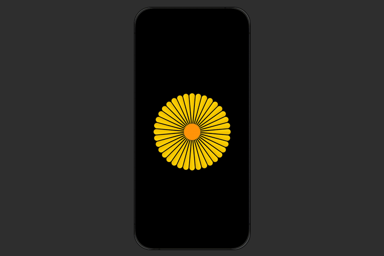
And that was it, we have a beautiful Daisy Flower. Try exploring with different sizing number and may be there will be a Shape that surprise you.
The beauty of Shape is that with this from now we have a beautiful flower that can be reused inside our App. Let's make it a reusable component by extracting its properties out:
struct YellowDaisyFlower: View {
    @State var angle: Double = 0
    @State var scale: CGFloat = 0
    var delayTime: Double = 0.1
    var widthOutside: CGFloat
    var petalColor: Color

    var body: some View {
        ZStack {
            ForEach(0..<36) { item in
                DaisyPental()
                    .fill(petalColor.gradient)
                    .frame(width: widthOutside, height: widthOutside*(2/11))
                    .offset(x: widthOutside*(75/110))
                    .rotationEffect(.degrees((Double(item) * angle) + 30))
                    .scaleEffect(CGFloat(scale))
            }
        }
        .overlay {
            Circle()
                .frame(width: widthOutside*(6/11), height: widthOutside*(6/11))
                .foregroundColor(.orange)
        }
        .padding()
        .onAppear {
            withAnimation(.easeInOut(duration: 4).delay(delayTime)) {
                angle = 10
                scale = 1
            }
        }
    }
}
We will make the width and the pental color become the properties of our shape.
Now let's make our daisy garden:
struct DaisyGardenView: View {
    private var columns: [GridItem] = Array(repeating: GridItem(.flexible()), count: 8)
    let colors: [Color] = [.red, .orange, .yellow, .green, .blue, .teal, .indigo, .mint]

    var body: some View {
        VStack(spacing: 2) {
            ForEach(0..<8) { _ in
                HStack(spacing: 2) {
                    ForEach(0..<8) { index in
                        GeometryReader { geometry in
                            let width = (geometry.size.width - 16) / 2
                            let frameWidth = geometry.size.width
                            YellowDaisyFlower(delayTime: Double(index) * 0.1, widthOutside: width, petalColor: colors.randomElement() ?? .primary)
                                .aspectRatio(1, contentMode: .fit)
                                .frame(width: frameWidth, height: frameWidth, alignment: .center)
                        }
                        .aspectRatio(1, contentMode: .fit)
                    }
                }
            }
        }
        .frame(maxWidth: .infinity, maxHeight: .infinity)
        .preferredColorScheme(.dark)
    }
}
Result:
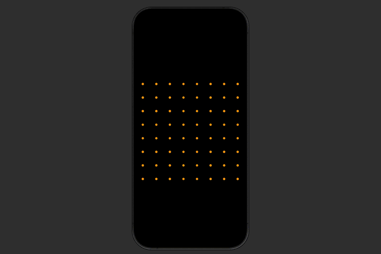
With a simple 8 by 8 stack and the help of GeometryReader container view, we are able to extract the necessary width and make our colorful daisy garden.
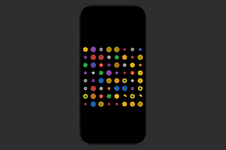
Here is a variety flower garden:
Don’t limit yourself to basic shapes. Start creating unique, eye-catching designs today with custom shapes in SwiftUI today.
Signup now to get notified about our
FREE iOS Workshops!
