ProgressView in SwiftUI
Jul 13, 2024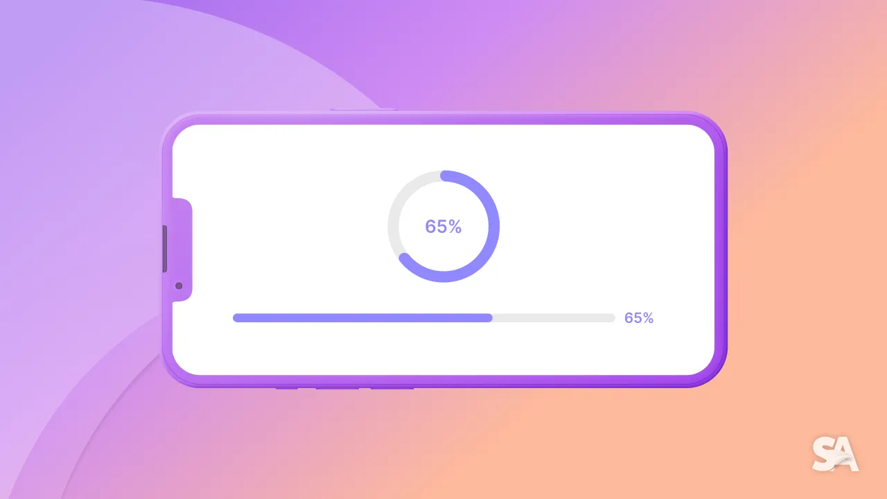
Nobody likes to see the loader or the progress bar that appears when the internet is slow or the app is processing data.
Even though we all don't like to see it, making a progress view is inevitable and at some point, you will have to use it in your app. May it be for showing process while you save data to CoreData or to show progress while you are getting data from URLSession.
ProgressView is a SwiftUI view which shows the progress as the task is close to its completion. It is a common practice to show a progress view in apps to indicate the users that the app is not stuck but is taking time to perform the associated task.
Table of Contents
- How to implement a Progress Bar in SwiftUI
- Indeterminate ProgressView
- Change ProgressView Size in SwiftUI
- Determinate ProgressView
- ProgressView spanning a date range
- SwiftUI ProgressView Style
- How to change ProgressView Color in SwiftUI
How to Implement a Progress Bar in SwiftUI
In SwiftUI, the basic implementation of a progress view is really straightforward. You simply have to use a built-in component called ProgressView.
struct ContentView: View {
    var body: some View {
        ProgressView()
    }
}
Result:

The above progress view shows a spinner image but don't indicate how much time a task will take to complete or the current progress state. Based on whether the duration of the task is known in advance or not, we can create two types of progress views:
- Indeterminate progress view
- Determinate progress view
Indeterminate ProgressView
As the name suggests, Indeterminate progress view is used when the exact duration of the task is unknown. For example, while refreshing an app or while an app connects to the internet to load data.
In this case, only a spinning circular image is displayed to the user, also called an activity indicator. So, what you just learned above in the basic implementation of the progress view is a Indeterminate progress view.
Now, if you want to give additional context to the users about the ongoing task, you can also add a description by simply passing a string to it. Else, if you want to create a specific view to add as a description, then you can use the progress view initialiser with a custom label.
struct ContentView: View {
    var body: some View {
        ProgressView("Loading..")
        ProgressView {
            HStack{
                Image(systemName: "hand.raised")
                Text("Please wait..")
            }
        }
    }
}
Result:

Change ProgressView Size
In addition to this, you can also change the size of the progress view to say, small, regular(default) and large, using the controlSize modifier.
struct ContentView: View {
    var body: some View {
        VStack(spacing: 10) {
            ProgressView()
                .controlSize(.small)

            ProgressView()
                .controlSize(.regular)

            ProgressView()
                .controlSize(.large)
        }
    }
}
Result:

Determinate ProgressView
Determinate progress view is used when the duration of the task is determined in advance. It helps users better estimate the amount of time a task will take. It can be used while your app performs tasks like installation process, file uploads or during a data backup.
A determinate progress view shows the progress of a task by filling a linear or circular track as the task moves to it completion.
The ProgressView initialiser for this type of progress view can take in 4 parameters:
- value - this is a binding to a numeric state variable depicting the amount of task completed to this point. It's value lies between 0.0 nd total
- total(optional) - denotes completion of the task with a default value of 1.0
- label(optional) - describes the task in progress
- currentValueLabel(optional) - defines the current amount of task completed.
@State private var progress: Float = 20

struct ContentView: View {
    var body: some View {
        ProgressView(value: progress, total: 100) {
            Text("Processing..")
        } currentValueLabel: {
            Text("Current progress: \(Int(progress))%")
        }
    }
}
Result:

In the above code, the initial progress starts at 20 and the task will be considered complete when the progress reaches a total of 100. The currentValue label dynamically shows the current progress percentage. You can manually update the progress by setting a timer to increment the progress at specified intervals.
ProgressView spanning a date range
This is one of the great additions to progress view post WWDC'22 where you can have a progress view which updates automatically as per defined interval.
Say, you are building a grocery delivery app which delivers the grocery in 10 minutes. You can easily show a progress view to show the time it'll take to deliver the grocery.
@State private var dateRange = Date()...Date().addingTimeInterval(10*60)

struct ContentView: View {
    var body: some View {
        ProgressView(timerInterval: dateRange, countsDown: true) {
            Text("Grocery reaching your doorstep soon...")
        }
    }
}
Result:

The countDown value decides whether the progress track will get filled or empty as time passes.
SwiftUI ProgressView Style
There are two types of progress view styles available. One is the circular style which is the default progress view style of indeterminate progress view. The second is linear style which updates according to the value given and is default for determinate progress view.
In case of determinate progress view, you can also switch from linear to circular style by simply using the progressViewStyle modifier.
@State private var progress: Float = 20

struct ContentView: View {
    var body: some View {
        ProgressView(value: progress, total: 100) {
            Text("Processing..")
        } currentValueLabel: {
            Text("Current progress: \(Int(progress))%")
        }
        .progressViewStyle(.circular)
    }
}
Result:

Note:
- iOS doesn't support a circular determinate progress view and indeterminate linear progress view.
- However macOS supports both. A circular determinate progress view is displayed as a filling circular track as the task moves to it completion and a linear indeterminate progress view presents an animated progress bar to indicate that the app is performing a task.
- You can also provide a custom style to the progress view by creating a styling struct which confirms to
ProgressViewStyleprotocol and then passing it to theprogressViewStylemodifier.
How to change ProgressView Color in SwiftUI
You can change the color of the progress view using `tint` modifier and not just that you can change the color of the progress view background and label using `background` and `foregroundStyle` modifiers respectively. A border can also be added to a progress view by giving a color and a width to the `border` modifier.
@State private var progress: Float = 20

struct ContentView: View {
    var body: some View {
        ProgressView(value: progress, total: 100) {
            Text("Processing..")
        } currentValueLabel: {
            Text("Current progress: \(Int(progress))%")
        }
        .padding()
        .tint(.green)
        .foregroundStyle(.blue)
        .background(Color.gray.opacity(0.25))
        .border(.yellow, width: 2)
    }
}
Result:

You can also apply the same to the circular progress view.
Result:

Congratulations! You deserve to celebrate this moment. Today you learned about Progress View in SwiftUI, it's types, how to show a progress bar in a couple of ways and how to style it's appearance.
To expand your knowledge about ProgressView, we would highly recommend you to explore articles like How to show progress on a task using ProgressView in SwiftUI and How to create a Circular Progress Bar in SwiftUI.
Signup now to get notified about our
FREE iOS Workshops!
