Charts in SwiftUI
Nov 29, 2023
In the dynamic landscape of mobile application development, creating visually engaging and insightful charts is a crucial aspect of conveying information effectively to users.
SwiftUI, Apple's declarative UI framework, brings a seamless and intuitive approach to building user interfaces. Within the SwiftUI framework lies a powerful framework for data visualization — SwiftUI Charts.
Introduction
Charts is a specialized framework designed to simplify the integration of charts and graphs into SwiftUI-based applications.
This framework empowers developers to create various types of charts, including line charts, bar charts, pie charts, and more, with minimal code and maximum flexibility.
Through SwiftUI's declarative syntax, developers can describe the appearance and behavior of charts in a concise and expressive manner, making the creation of interactive and aesthetically pleasing data visualizations a straightforward process.
Let's get familar with the building blocks of Charts.
Chart view
The Chart view is a container view that holds the content of the chart. You can add different chart markers, such as BarMark, LineMark, PointMark, AreaMark, and RuleMark, to the chart to represent data points or specific chart elements.
Markers
Marks are the graphical elements that represent the data in a chart. They can take various forms such as points, bars, lines, or wedges in pie charts. Marks visually convey the information contained in the data.
Modifiers
Modifiers are used to customize the behavior and appearance of the chart. They enable you to override default settings and apply specific transformations or enhancements to the chart and its elements. Modifiers can be used to add animations, adjust interactivity, or modify visual aspects.
Data
Data is the core information that drives the chart. It consists of the values and labels that define the content and structure of the chart. Data is typically provided in an organized format, such as arrays or dictionaries, and is used to populate the marks in the chart.
Now let's build some charts.
Setting up Data
We will create a chart represent monthly sales of a small business shop. Like make our model:
struct MonthlySales: Identifiable {
    var id: UUID = .init()
    var date: Date
    var sales: Double

    var month: String {
        let dateFormatter = DateFormatter()
        dateFormatter.dateFormat = "MMM"
        return dateFormatter.string(from: date)
    }

    var year: String {
        let dateFormatter = DateFormatter()
        dateFormatter.dateFormat = "yyyy"
        return dateFormatter.string(from: date)
    }
}
Our model has 5 properties, each instance needs unique id so that we can distinguish them and be able to query through.
The main information of each instance will be the date represent the period that taken in and sales for total sales in that period of time.
The two remain properties month and year are for chart representation later. These 2 are computed properties which will extract the month and year component from the date and return them as a string.
For more convenience later to create data, we will use this extension:
extension Date {
    static func createDate(_ day: Int, _ month: Int, _ year: Int) -> Date {
        var components = DateComponents()
        components.day = day
        components.month = month
        components.year = year

        let calendar = Calendar.current
        let date = calendar.date(from: components) ?? .init()

        return date
    }
}
With this extension, we can easily create a day by passing number of day, month and year. Now let's create this year sales data:
let thisYearFirst6Month: [MonthlySales] = [
        .init(date: .createDate(1, 1, 2023), sales: 6000),
        .init(date: .createDate(1, 2, 2023), sales: 4650),
        .init(date: .createDate(1, 3, 2023), sales: 6750),
        .init(date: .createDate(1, 4, 2023), sales: 8550),
        .init(date: .createDate(1, 5, 2023), sales: 5500),
        .init(date: .createDate(1, 6, 2023), sales: 5000),
    ]
Great! We have the sales data of the first 6 months of 2023. We declare our data as a global constant for convenient use through all our chart views.
With this data, let's start drawing some charts to better understand of what's stories these numbers have to tell. Starting with Bar chart.
Bar chart
It's important to choose the appropriate chart type based on the nature of your data and the story you want to tell.
Bar charts are best used for visualizing and comparing categorical data or discrete values.
They are particularly effective in the following scenarios:
• Comparing data
• Showing trends over time
• Displaying rankings
• Presenting survey or poll results
• Comparing performance metric
Making charts using Charts framework is very simple. Here how it is:
struct BarChartView: View {
    var body: some View {
        Chart(thisYearFirst6Month, id: \.id) { sale in
            BarMark(
                x: .value("Month", sale.month),
                y: .value("Sales", sale.sales)
            )
        }
        .frame(height: 300)
        .padding()
    }
}
Result:
To create any chart, we need a Chart container view. Then pass in our data and represent each of by a Mark inside a chart. For Bar chart, we use BarMark which will need the label and value representing for the x-axis and y-axis.
Our x-axis label is time period by month. The y-axis will be the sales.
How simple is this! We now have a beautiful bar chart with less then 10 lines of code.
The power of this new framework is that, it comes with many modifiers for us to freely customise our charts. Let's enhance our chart using cornerRadius and foregroundStyle modifiers.
struct BarChartView: View {
    var body: some View {
        Chart(thisYearFirst6Month, id: \.id) { sale in
            BarMark(
                x: .value("Month", sale.month),
                y: .value("Sales", sale.sales)
            )
            .cornerRadius(5)
            .foregroundStyle(by: .value("Month", sale.month))
        }
        .frame(height: 300)
        .padding()
    }
}
Result:
Beautiful! With the cornerRadius we add the rounded corner and make our bar more elegant. Then we tell SwiftUI to distinguish our bar base on the Month value which is our x-axis.
Now for example if we just want the bars alone, all of the additional components can be hidden:
.chartXAxis(.hidden)
.chartYAxis(.hidden)
.chartLegend(.hidden)
Result:
Or changing the background:
.chartPlotStyle(content: { plotContent in
	plotContent
		.background(.thinMaterial)
})
Result:
Another very interesting modifier is chartYScale, we can use it to change the bench mark of the axis:
.chartYScale(domain: 0...20000)
Result:
Let's revert to the previous version since it looks the best:
struct BarChartView: View {
    var body: some View {
        Chart(thisYearFirst6Month, id: \.id) { sale in
            BarMark(
                x: .value("Month", sale.month),
                y: .value("Sales", sale.sales)
            )
            .cornerRadius(5)
            .foregroundStyle(by: .value("Month", sale.month))
        }
        .chartPlotStyle(content: { plotContent in
            plotContent
                .background(.thinMaterial)
        })
        .frame(height: 300)
        .padding()
    }
}

Now for the final enhancement, let's add a line representing the average sales in the first half of 2023. We can use the RuleMark to represent data using a single horizontal or vertical rule.
First let's add the function calculating the average sale:
func average(_ sales: [MonthlySales]) -> Double {
    var average: Double = 0
    for sale in sales {
        average += sale.sales
    }
    return average / Double(sales.count)
}
Within our Chart, let's add the new RuleMark representing the average sale:
RuleMark(y: .value("Average", average(thisYearFirst6Month)))
Result:
Let's make it better by adding more modifiers:
struct BarChartView: View {
    var body: some View {
        Chart(thisYearFirst6Month, id: \.id) { sale in
            RuleMark(y: .value("Average", average(thisYearFirst6Month)))
                .foregroundStyle(.white)
                .lineStyle(StrokeStyle(lineWidth: 1, dash: [5]))
                .annotation(alignment: .leading) {
                    Text("Average")
                        .font(.caption)
                        .foregroundStyle(.secondary)
                }
            BarMark(
                x: .value("Month", sale.month),
                y: .value("Sales", sale.sales)
            )
            .cornerRadius(5)
            .foregroundStyle(by: .value("Month", sale.month))
        }
        .chartPlotStyle(content: { plotContent in
            plotContent
                .background(.thinMaterial)
        })
        .frame(height: 300)
        .padding()
    }
}
Result:
We change its color and style using the foregroundStyle and the lineStyle modifiers. Then for better user experience, we add a text description with the annotation modifier. The final result is stunning!
As you can see, we have gone from an array of data to a beautiful informative chart quite easily. That's the power of Chart.
Pie chart
Now let's represent this data in Pie chart.
Pie charts are best used for visualizing the composition or distribution of categorical data.
Switching is very easy, for Pie chart we will be using SectorMark: A sector of a pie or donut chart, which shows how individual categories make up a meaningful total.
struct PieChartView: View {
    var body: some View {
        Chart(thisYearFirst6Month, id: \.id) { sale in
            SectorMark(angle: .value("Sales", sale.sales))
                .foregroundStyle(by: .value("Month", sale.month))
        }
        .frame(height: 300)
        .padding()
    }
}
Result:
The syntax is almost idetical and declarative to SwiftUI. And we have many modifiers to customize it:
struct PieChartView: View {
    var body: some View {
        Chart(thisYearFirst6Month, id: \.id) { sale in
            SectorMark(angle: .value("Sales", sale.sales), angularInset: 1)
                .cornerRadius(5)
                .foregroundStyle(by: .value("Month", sale.month))
        }
        .chartLegend(position: .bottom, alignment: .center, spacing: 25)
        .frame(height: 300)
        .padding()
    }
}
We use angularInset add some spacing between the pie and cornerRadius for an elegant look. Also, the legend is better center and need more spacing. All could be done with chartLegend come right in the box.
Result:
Beautiful, one more additional detail is that for Pie chart, it is usually depict in order of descending. So let's sort on the basis of sale number:
struct PieChartView: View {
    var body: some View {
        Chart(thisYearFirst6Month.sorted(by: { $0.sales > $1.sales }), id: \.id) { sale in
            SectorMark(angle: .value("Sales", sale.sales), angularInset: 1)
                .cornerRadius(5)
                .foregroundStyle(by: .value("Month", sale.month))
        }
        .chartLegend(position: .bottom, alignment: .center, spacing: 25)
        .frame(height: 300)
        .padding()
    }
}
Result:
Line chart
Let's go through another type of commonly use: Line chart. You may guess it, we have another mark for it: LineMark. With just a little modifications:
struct LineChartView: View {
    var body: some View {
        Chart(thisYearFirst6Month, id: \.id) { sale in
            LineMark(
                x: .value("Month", sale.month),
                y: .value("Sales", sale.sales)
            )
        }
        .frame(height: 300)
        .padding()
    }
}
Result:
Remember with Bar chart, we can use RuleMark to add an average line, well for Line chart there is PointMark that goes well with it. In our Chart view:
PointMark(
	x: .value("Month", sale.month),
	y: .value("Costs", sale.sales)
)
.annotation(position: .overlay, alignment: .bottom, spacing: 10) {
	Text("\(Int(sale.sales))")
		.font(.caption)
}
The value will be the same as using in LineMark. And we can add annotation to show the value of each period:
Result:
Finally, we can have multiple lines too. First let's make another set of data about the same sales happened in 2022:
private let lastYearFirst6Month: [MonthlySales] = [
    .init(date: .createDate(1, 1, 2022), sales: 2950),
    .init(date: .createDate(1, 2, 2022), sales: 4700),
    .init(date: .createDate(1, 3, 2022), sales: 2750),
    .init(date: .createDate(1, 4, 2022), sales: 1500),
    .init(date: .createDate(1, 5, 2022), sales: 5540),
    .init(date: .createDate(1, 6, 2022), sales: 7000),
]
Now let's add another line represent last year in comparison. We will use foregroundStyle to style them different based on year:
struct LineChartView: View {
    var body: some View {
        Chart(thisYearFirst6Month + lastYearFirst6Month, id: \.id) { sale in
            LineMark(
                x: .value("Month", sale.month),
                y: .value("Sales", sale.sales)
            )
            .foregroundStyle(by: .value("Year", sale.year))

            PointMark(
                x: .value("Month", sale.month),
                y: .value("Costs", sale.sales)
            )
            .foregroundStyle(by: .value("Year", sale.year))
            .annotation(position: .overlay,
                        alignment: .bottom,
                        spacing: 10) {
                Text("\(Int(sale.sales))")
                    .font(.caption)
            }
        }
        .frame(height: 300)
        .padding()
    }
}
Result:
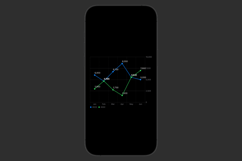
We now have an informative chart to tells us the stories differently in 2 years. And all is done easily with the new Charts framework.
Conclusion
The beauty of SwiftUI Charts lies not only in its simplicity but also in its ability to seamlessly integrate with other SwiftUI components. As a result, developers can craft immersive user experiences that combine data-driven insights with a consistent and visually appealing interface.
In this era of information-centric applications, Charts stands as a valuable tool for developers seeking to enhance their apps with compelling visualizations.
Whether you're building a financial app, fitness tracker, or any software requiring data representation, Charts empowers you to transform raw data into compelling narratives, making your applications more engaging and user-friendly.
We have launched our new e-book "Cracking the iOS Interview" with Top 100 iOS Interview Questions & Answers. Our book has helped more than 394 iOS developers in successfully cracking their iOS Interviews.
Signup now to get notified about our
FREE iOS Workshops!
